Focus. Ikko Tanaka: Faces. Posters
Author:
Die Neue Sammlung
min
Reading Time
Mirko Borsche. Dot, point, comma, stroke
Everyone is familiar with Smileys – they are the most frequently used and most popular of the emoticons, also known as emojis. To symbolize an Emoticon normal characters on a keyboard are combined with one another: Points, commas, strokes…
In e-mail communications or in text messages and other digital short messages, together they form faces and serve to express emotions, moods and feelings – or at least intimate these. This can range from a smile with a wink, loud laughter, or sticking out your tongue gloatingly – and can even include crying, anger, fear, disgust, coolness etc.
For the presentation “Ikko Tanaka: Faces. Posters“, Munich-based graphic designer Mirko Borsche created the German-English exhibition title attached to the pillar in the rotunda at the entrance to the exhibition.
The large letter “C” in the words “Faces” and “Gesichter” is in both instances replaced by a smiling face in the form of a minimalist emoticon that consists of only a bracket and a colon. Namely in order to represent the letter “C”, in this instance an inverted one, meaning an
( : instead of an : )
Incidentally, in Japan or Korea emoticons are not depicted horizontally, but presented vertically.
^!^ *_*
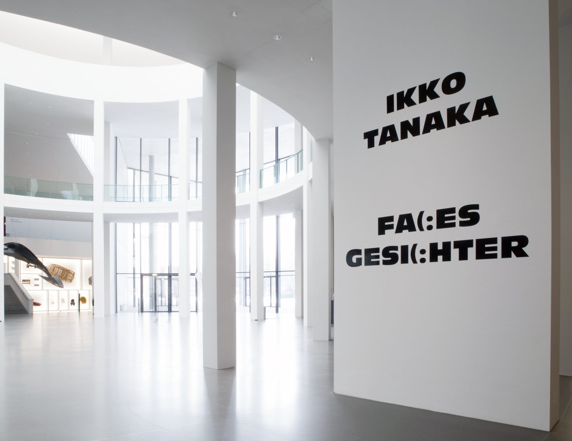
There is a correspondence to Mirko Borsche’s design idea on the other side of the pillar in the form of the Japanese title, created by Japanese graphic designer Tetsuya Ohta in Tokyo.
Tetsuya Ohta. Face. Font. Printing type
The word “Face” with its innumerable meanings also refers in printing to the type as in typeface and thus here references printing per se and in particular the fonts.
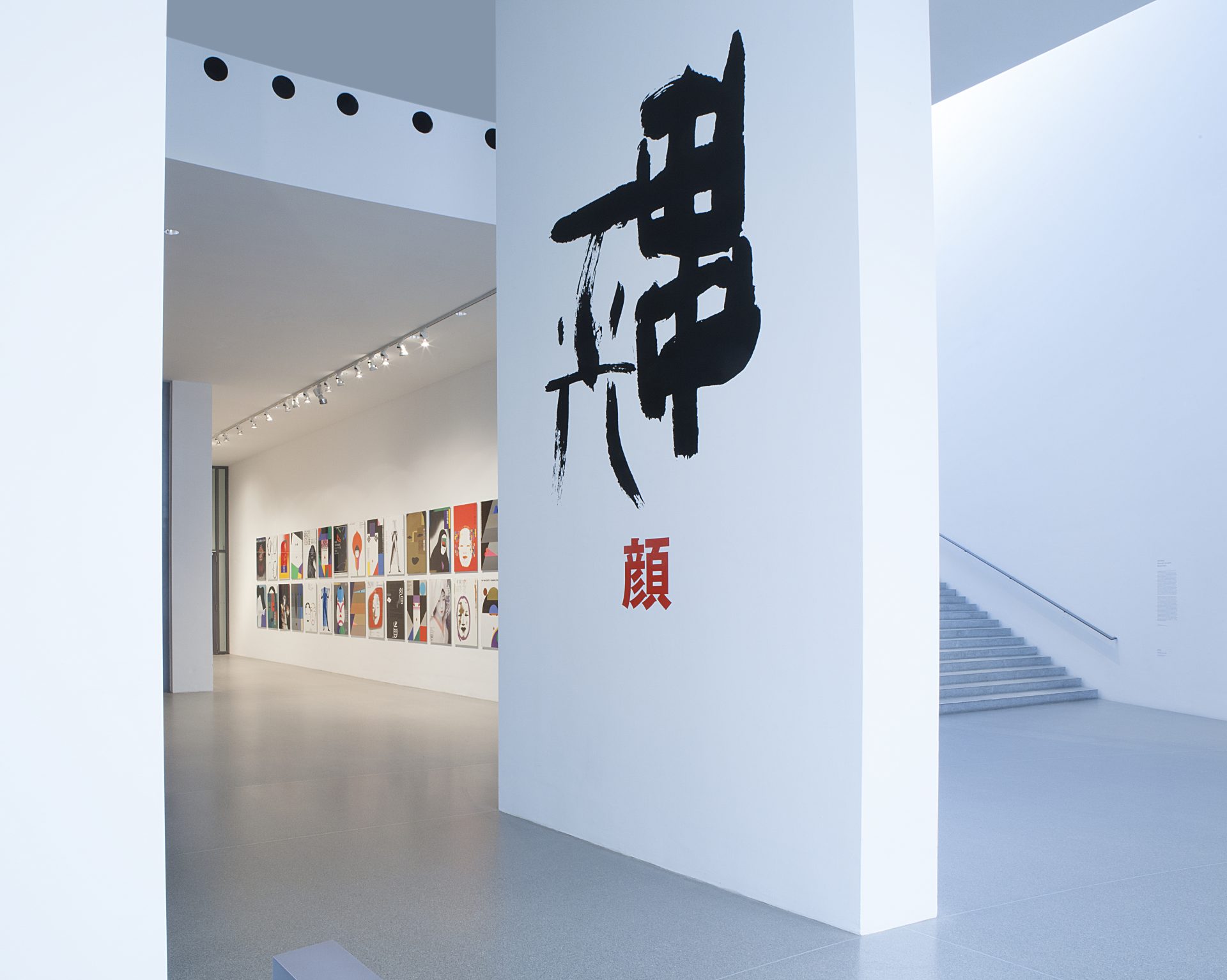
A large, Japanese typeface greets visitors to Pinakothek der Moderne until mid-July 2018…
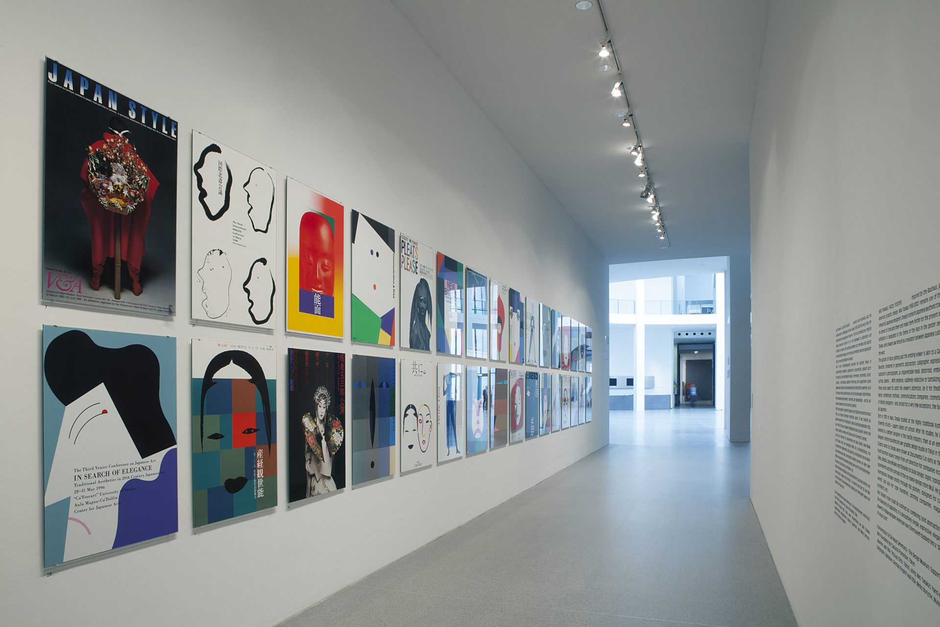
…and illegibly for most sets – a strong graphic message that evidently has something to do with the wall behind it, on which two rows of posters are to be seen, in bright colors and likewise in a largely incomprehensible script.
For the exhibition “Ikko Tanaka: Faces. Posters“, a presentation from the museum collection at Neue Sammlung, Japanese graphic designer Tetsuya Ohta has created the “headliner”, the typographical theme for the entrance displayed on the pillar in the rotunda.
For this purpose, Ohta used Ikko Tanaka’s hand-written signature blown-up to cover the whole wall, written in black from top to bottom, and from right to left: “Tanaka Ikko”. Beneath it in red, and shaped like a seal on a graphic sheet, stands the character for “face”. Unlike the expressive signature, this character is a typeface. As is customary in Japanese, the person’s name and the term are both reproduced by Chinese Kanji characters.
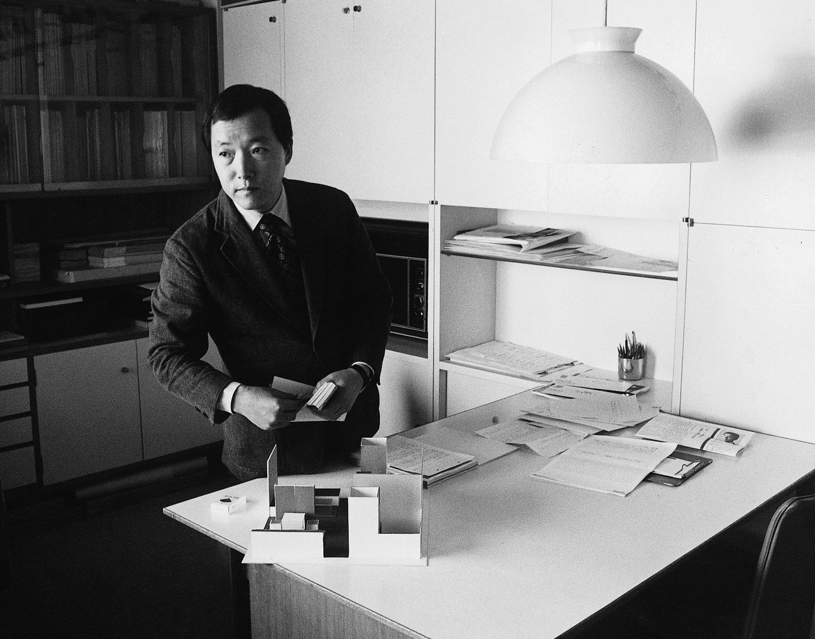
As of 1963 Tetsuya Ohta was the first assistant and staff member of Ikko Tanaka working in the latter’s graphic studio in Tokyo, which opened in 1963; in 1975 Ohta opened his own studio. The design of the typography on the pillar and the graphics for the exhibition poster and flyer can all be read as his homage to Ikko Tanaka.
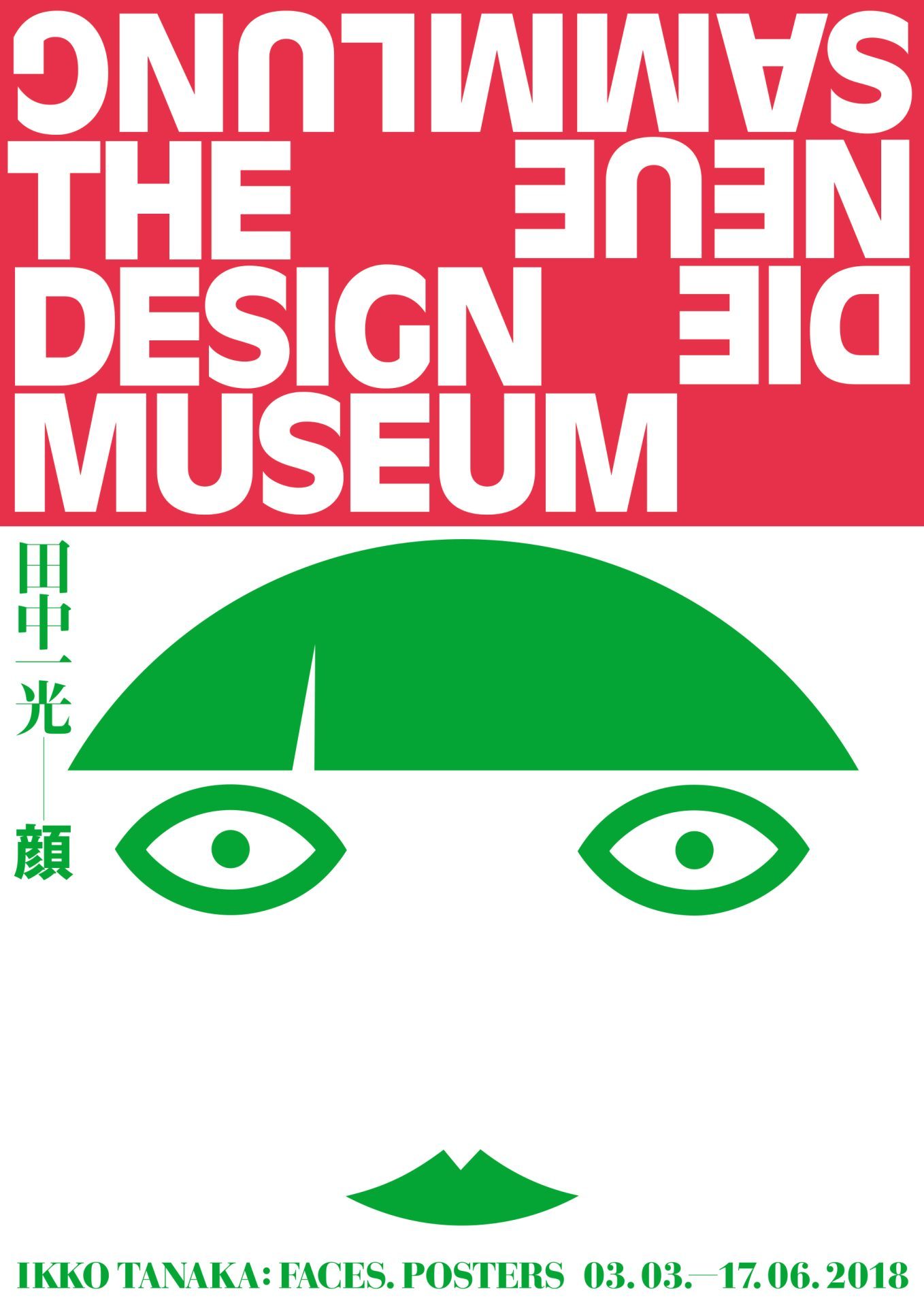
Exhibition poster as an homage by the former “pupil” for his master
For the exhibition, at the request of Neue Sammlung Tetsuya Ohta designed the title theme for the exhibition poster and the flyer.
Ohta made use of an Ikko Tanaka self-portrait for the poster and the flyer with an identical cover. Tanaka probably drew the highly abstract graphic with the suggestive gaze around 1960.
While Ohta placed the English exhibition title and dates beneath the face in the horizontal strip defining the lower edge of the poster, to the left of the face like a small banner hangs the abbreviated Japanese title in Kanji characters: “Tanaka Ikko – Face”.
Born in Nobeoka in 1941, Tetsuya Ohta graduated from the Kuwazawa Institute of Design in 1976. After working in the Ikko Tanaka Design Studio, established Tetsuya Ohta Design Studio in Tokyo in 1975. Exhibitions: “CI of Japanese Companies”, 1985 at Matsuya Department Store; “Diagram” at Ginza Graphic Gallery, 1991. Awards he has received include: Ministry of International Trade and Industry Award of the National Cover Design Concours in 1991, ADC Award and Hiromu Hara Award in 1992 among others. He is a member of JAGDA, JTA, International Typography A. Type 1.
The design and realization of the Japanese wall title was made possible with the kind support of
DNP Foundation for Cultural Promotion, Tokyo.
Exhibition