Awards. Bureau Mirko Borsche
Author:
Die Neue Sammlung
min
Reading Time
Red Dot Award: Communication Design 2016
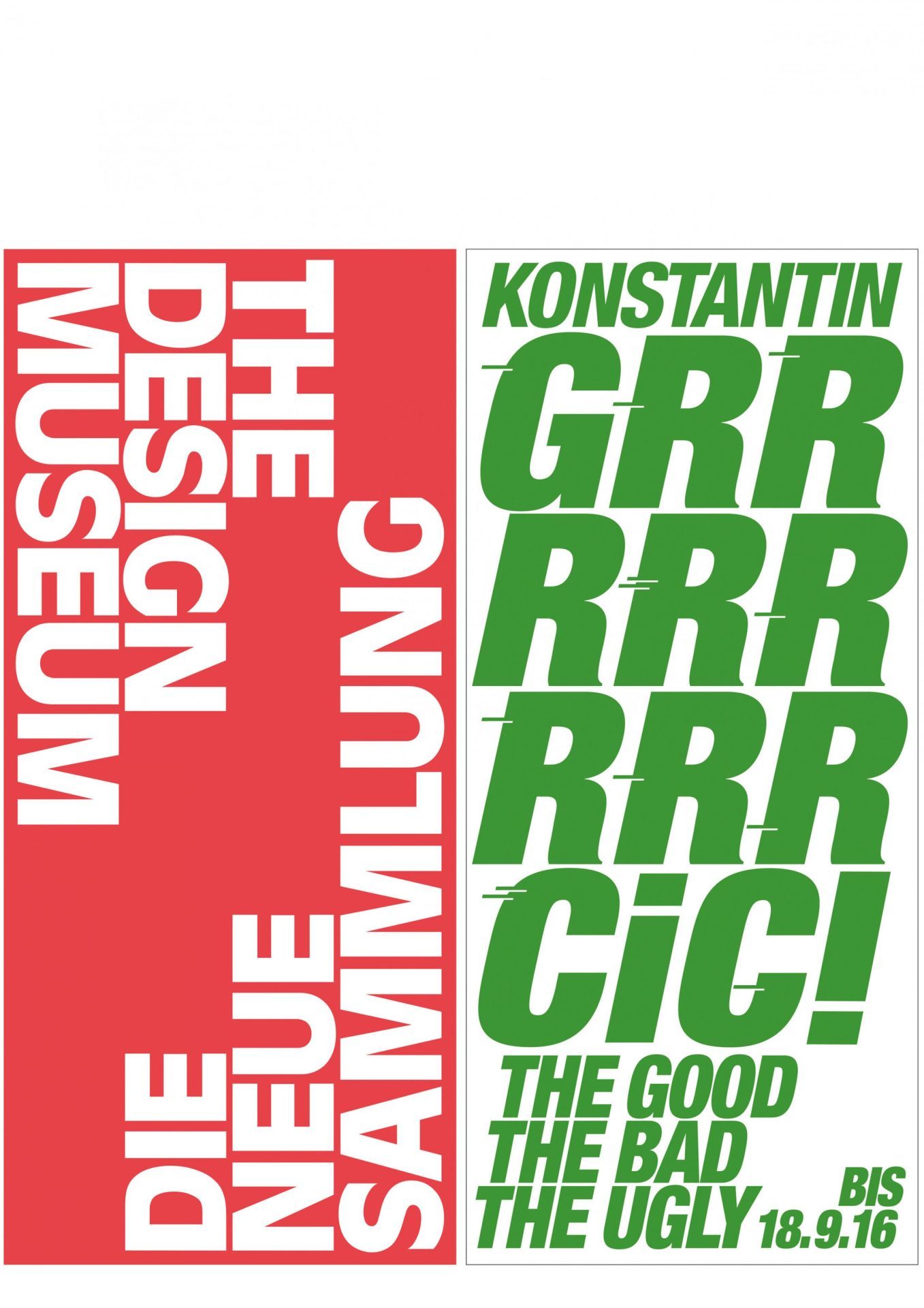
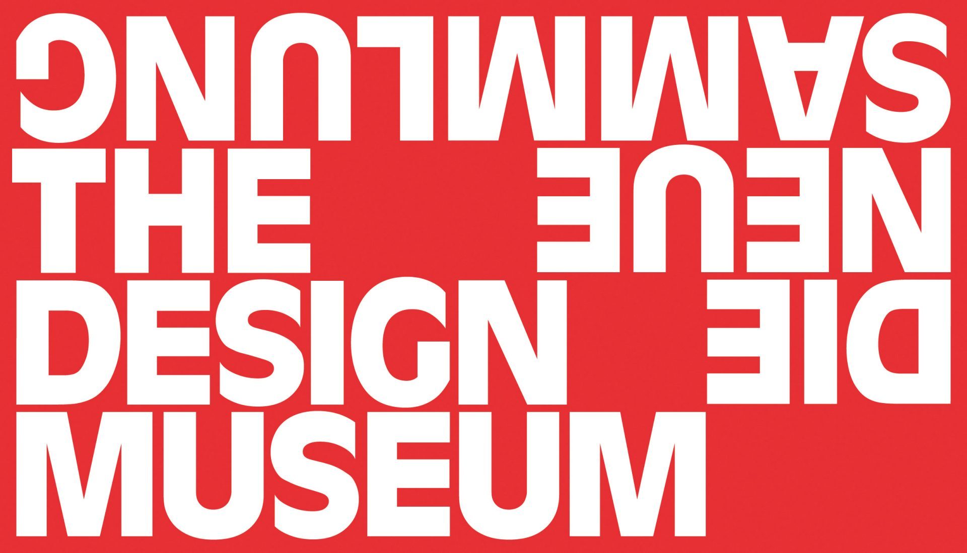
Die Neue Sammlung – The Design Museum has a new corporate identity.
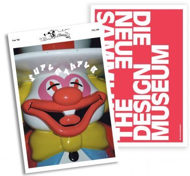
Designed together with Bureau Mirko Borsche, this new CI self-confidently reflects the Museum’s international significance and its new program.
Die Neue Sammlung is widely considered the world’s oldest design museum. Its collection is one of the largest and most important worldwide. Since it was founded it has been devoted to the present day. Die Neue Sammlung has set itself the objective of highlighting these peculiarities and giving it new charisma.
The slight change in name from “Die Neue Sammlung – The International Design Museum” to “Die Neue Sammlung – The Design Museum” stands for concentration and focus. The English wording makes the word “international” superfluous.
In terms of its facilities Die Neue Sammlung is making a new start, too: With the planned opening of a “Schaudepot“ in the same building, and a new format for site-specific exhibitions, new presentation forms will be possible which will provide visitors with new ways of approaching the exhibition and enable interactive communication.
The new CI makes this realignment visible. The name is communicated clearly and radically. The logo has become a slide that fills the space, as it were. Set against a red background the name is clearly legible. Just as the red and white stand for the institution, green and white stand for the information that announces forthcoming exhibitions and projects. The new CI highlights that the Museum is in symbiotic union with its collection, exhibitions, and projects.
The Neue Sammlung’s new CI has already attracted enormous attention and lots of visitors, including non-traditional ones, are already eagerly looking forward to the next posters and invitations.

German Brand Award ’16 Winner
Industry Excellence in Branding
Culture and non Governmental Organisation
“The new corporate identity developed by Bureau Mirko Borsche confidently reflects the international importance of the company and its new goals. The oldest design museum in the world, with a significant collection, demonstrates its visionary goals with its exhibitions and innovative forms of communication. Distinct and radical, the name is communicated on a red background. As the signal colour of the logo emphasises the institution, the colour green represents exhibitions and projects.”
